

Design
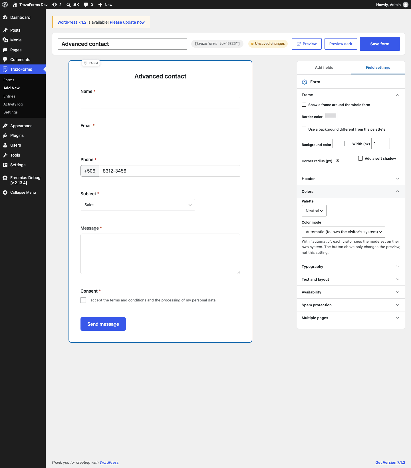
By the end of this page you will know every visual option a form has, all under the Form tag at the top left of the builder canvas. Everything here applies equally to the canvas and to the published form.
Colors
Section titled “Colors”| Setting | Options |
|---|---|
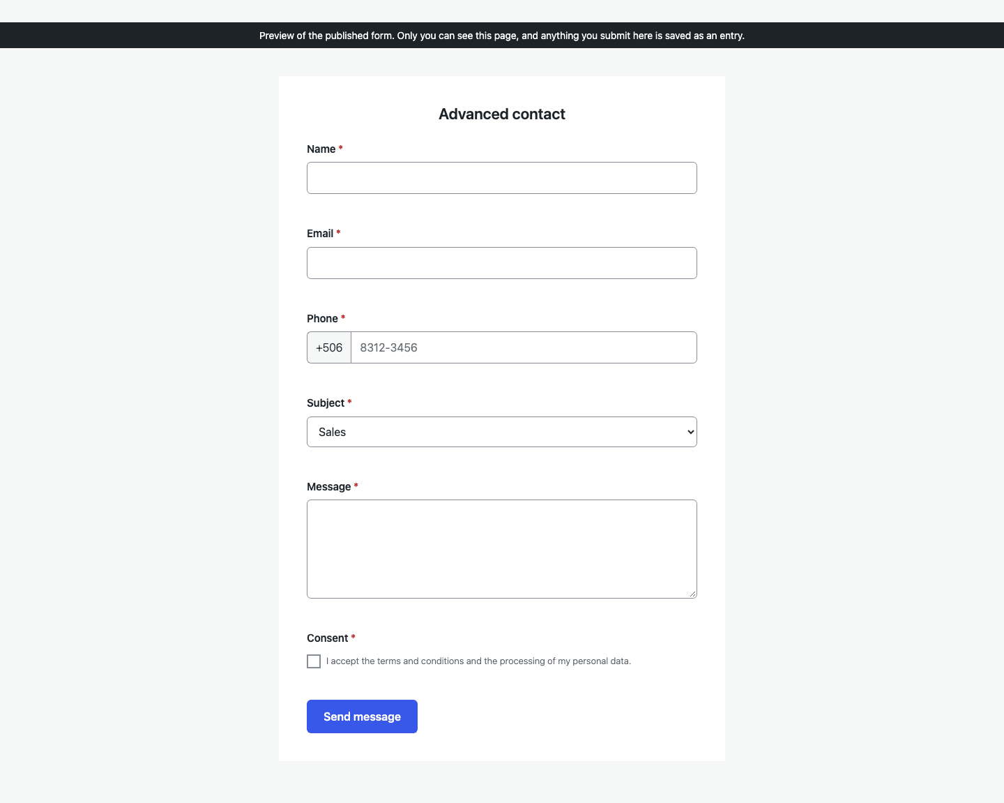
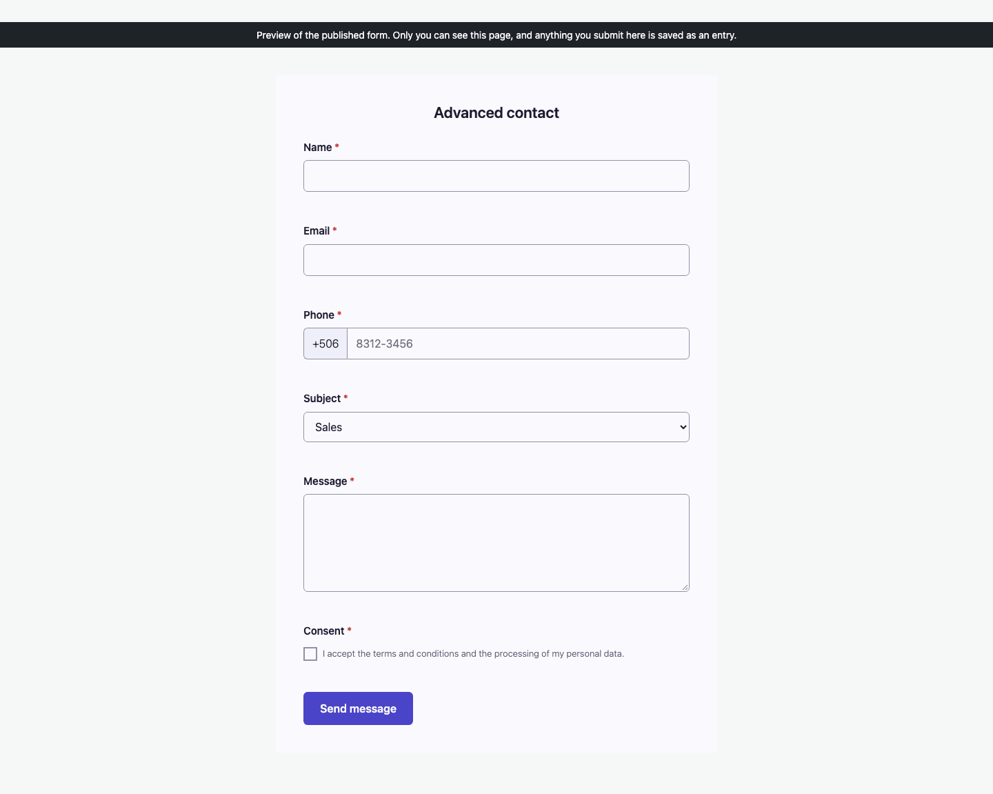
| Palette | Eleven palettes, each with a light and a dark version, ordered from the most sober to the most expressive: Neutral (whites and greys, the default), Indigo, Volt, Tide, Olive, Amber, Ember, Lime, Coral, Pixel and Prism. Every pair of text and background colors is checked against the WCAG 2.1 contrast minimums, in both modes. |
| Color mode | Automatic (follows the visitor’s system), the default, Always light, or Always dark. |
The Preview dark / Preview light button in the builder’s top bar only changes the canvas, never this setting.
Typography
Section titled “Typography”Font changes the typeface of the whole form: title, labels, fields and buttons.
| Group | Options |
|---|---|
| General | System font (fastest), the default, and Same as the site theme |
| Sans serif | Atkinson Hyperlegible Next, Inter and Figtree |
| Serif | Source Serif 4, Literata and Lora |
- The fonts are served from your own site, never from Google or any other external service, so visitors’ IP addresses are not shared with anyone.
- Visitors only download the font your form uses, and only the characters it needs. The system font and the theme font download nothing.
- Atkinson Hyperlegible Next was designed by the Braille Institute for readers with low vision: characters that are easy to confuse, such as
1,landI, or0andO, are clearly different. It is a good choice for forms that ask for codes, invoice numbers or ID numbers. - Same as the site theme only shows on the published form. In the builder canvas, it shows the WordPress dashboard font instead, since the form is not on a real page there yet.
Submit button
Section titled “Submit button”Select the Submit button at the end of the form to change its design:
| Setting | Options |
|---|---|
| Alignment | Left (default), Center or Right. |
| Width | Automatic (by the text), the default, or one of the same six grid fractions used for fields (see Field settings). You can also drag the button’s own edge on the canvas. |
| Size | Small, Medium (default) or Large — all three are at least 44px tall, a comfortable minimum to tap. |
| Color | Main color of the palette, the default, or A color of my own. With a custom color, the plugin calculates readable text (white or dark) for you automatically, and warns you live if no text color would reach the WCAG 2.1 minimum contrast on that background — without silently changing your chosen color. |
| Corner radius | From square corners to a full pill shape. Default: a small, soft rounding. |
Templates already set a button text that describes the action, such as Register my entry or Send message, which works better than a generic “Submit”.
With multi-page forms (Pro), a centered or right alignment moves Previous together with Next/Submit; with a left alignment, Previous stays on the left and the advancing button on the right.
Off by default. Show a frame around the whole form turns on:
- Border color, Width and Corner radius.
- Add a soft shadow.
- Use a background different from the palette’s: by default the form uses the background of its palette, which adapts to dark mode. A fixed background color stays the same in both modes, so check that the text is still readable on it.
Header
Section titled “Header”On by default. Show header (title, logo and background image) adds a header above the fields:
- The title shown is always the form’s own title.
- Add a Logo and a Background image from the media library.
- Header alignment: Left, Center (default) or Right.
- With a background image, the title is shown in white with a text shadow over a semi-transparent dark layer, so it stays readable without choosing a text color yourself.
If a header is on but has no title, logo or image, nothing is drawn — there is never an empty box.
Text and layout
Section titled “Text and layout”- Form description: shown above the fields, below the header.
- How to mark required fields: an asterisk, your own text or no visible mark. Whichever you choose, screen readers always announce that a field is required.
- Show an error summary at the top of the form: lists every error with a link to its field. On by default.
- Form CSS class: for your own styles.
Edge cases
Section titled “Edge cases”- An invalid design value never breaks the form. An unknown alignment, width or size, a non-hexadecimal color, or a corner radius out of range all fall back to their default value instead of being saved as entered.
- Palette colors are scoped to the form itself: they never leak into the surrounding WordPress admin screens or your site’s own theme.
Next step
Section titled “Next step”Continue to Notifications to set up the emails sent after a submission.